
Audit Overview
Your store's untapped revenue potential — and how to unlock it
Why We Created This Audit
We analyzed https://cellbell.in the same way we've audited 350+ e-commerce stores — looking for the specific gaps between your current experience and what top-performing Home & Living stores deliver. Every finding in this report is a revenue opportunity backed by industry data and competitive benchmarks.
What We Analyzed
- UX & Conversion Design11 findings
- Performance & Speedvs 3 competitors
- Technology & App StackPlatform + 11 apps
- Industry BenchmarksHome & Living
Pages Analyzed
- Homepage3 findings
- Collection Pages2 findings
- Product Pages (PDP)4 findings
- Cart & Checkout2 findings
 This audit was prepared by Growisto — a CRO-led Website development team behind 167% conversion growth for Atomberg, 46% CR lift for TyresNmore, and 350+ e-commerce projects.
UX & Conversion Findings
Page-by-page analysis with visual comparisons against top Home & Living stores
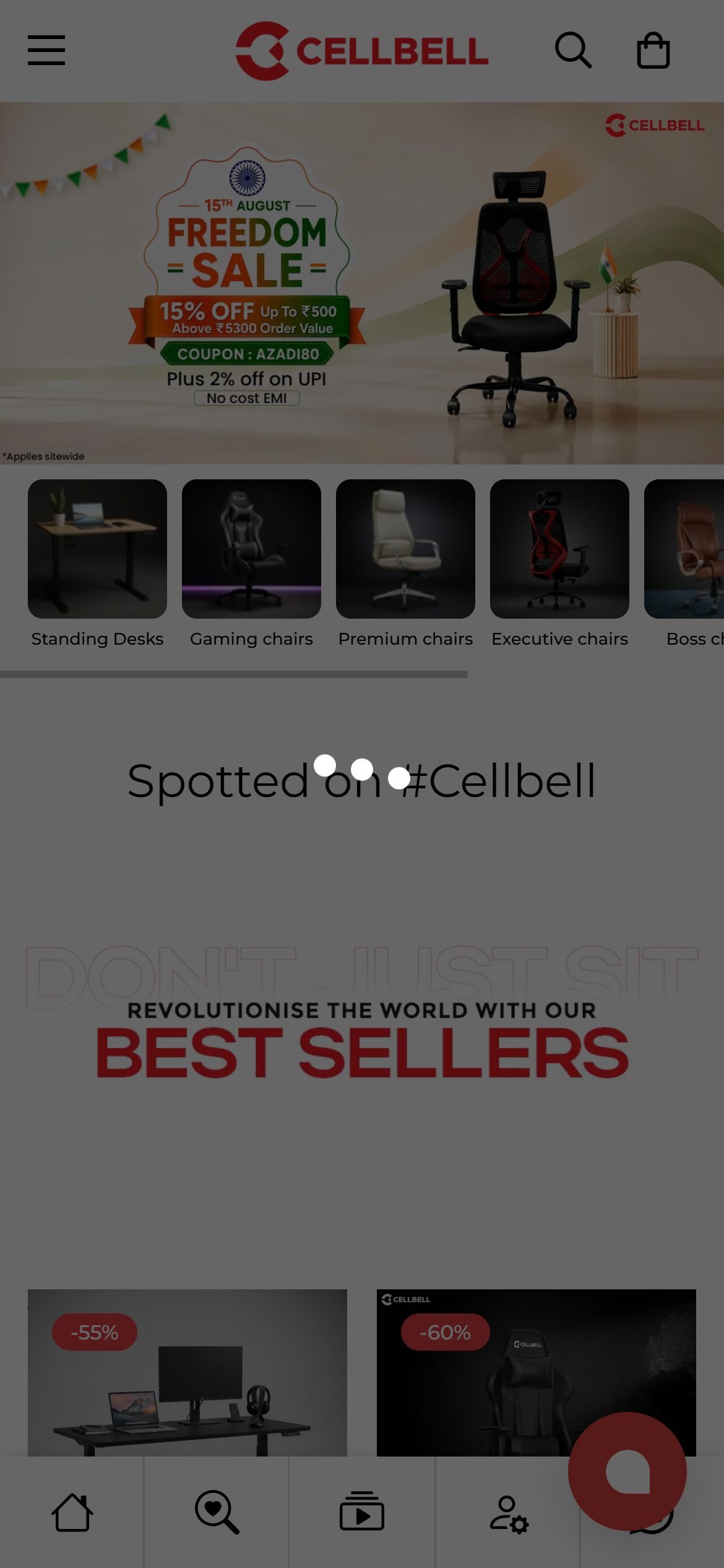
- Every product tile across the homepage's 'Freedom Sale' and 'Popular Choices' rows — Cellbell ErgoLift, Transformer Series Gaming Chair, Konquer Gaming Chair, six Desire C104 SKUs, Taurus C100, CELLBELL C190 Berlin, Franco C51 — shows only an image, title, review count and price.
- A DOM scan of every interactive element on the homepage confirms the only actionable control per tile is the product link itself; there is no '+', 'Quick Add', or Add-to-Cart button anywhere on a homepage card.
- Tapping anywhere on a tile routes the shopper to the full PDP, adding an extra page load and decision step before a repeat or low-consideration purchase (e.g. a bestseller already viewed) can be completed.
- Add a quick-add icon/button to each homepage product tile that adds the default (or lowest-price) variant directly to cart without leaving the page.
- For multi-variant chairs, have quick-add open a lightweight variant-select sheet instead of navigating to the PDP.
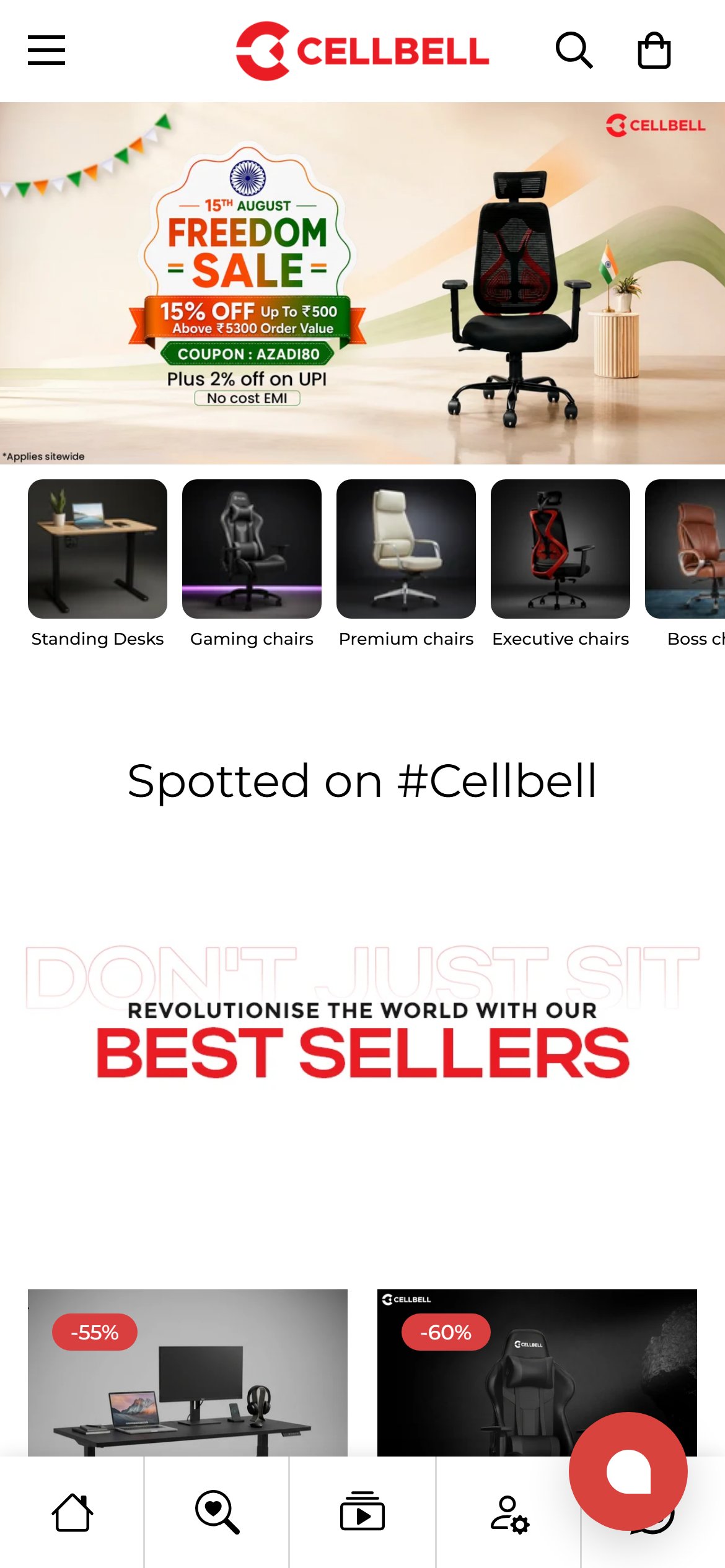
- A full scan of the homepage's first 2 scrolls — header, the 'Freedom Sale' hero, and the category icon row (Standing Desks / Gaming chairs / Premium chairs / Executive chairs / Boss chairs) — found zero iconographic trust or USP badges: no Free Delivery, Warranty, Secure Payment, or Easy Returns indicator anywhere in that region.
- CellBell already has this exact badge set built — 'Free Delivery', '1 Year Warranty', '7 Day Return' (class CP-usp-text) — but a DOM check confirms it only exists inside the cart-drawer component (m-cart-drawer), which renders at 0x0 until a shopper actually opens the cart; it never appears on the static homepage.
- The only other trust-adjacent text on the page — 'Warranty Registration' / 'Warranty Program' links — sits in the footer at y=4031px and below, more than 2 full mobile screens past the fold.
- Because the badge copy and styling already exist and are proven working inside the cart drawer, closing this gap is a placement fix, not new content to write from scratch.
- Add a compact 3-4 icon USP strip (Free Delivery / 1 Year Warranty / 7 Day Return / Secure Payment) directly below the hero banner or the category icon row, reusing the existing CP-usp-text component and copy already built for the cart drawer.
- Keep the strip above the 'Spotted on #Cellbell' section so it lands within the first 2 scrolls on mobile, where it can influence the shopper's initial browsing decision.
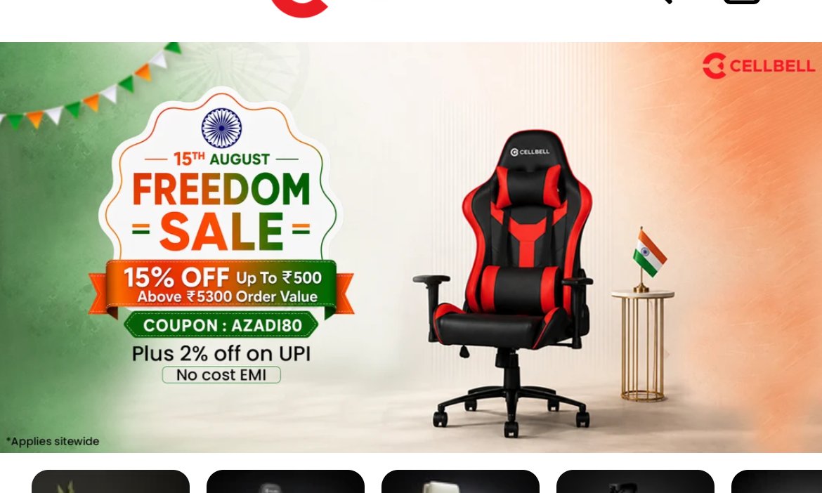
- A DOM check of the homepage hero slideshow across all 3 unique slides (data-slide 0, 1, 2) found the same pattern every time: one full-bleed covering the entire 390x195px slide, with empty link text and zero
- All of the actual offer copy — '15% OFF', 'COUPON: AZADI80', 'Plus 2% off on UPI', 'No cost EMI' — is baked into the slide's image file, so none of it is selectable text, readable by a screen reader, or swappable/testable without re-exporting a new image asset.
- Because the 'CTA' is a full-slide invisible link rather than a labeled button, there is no visual affordance — no button shape, no contrasting color, no action text — signalling to a shopper that the banner is tappable at all.
- The pattern is identical across all 3 slides in the rotation, confirming this is a template-level gap rather than a one-slide oversight.
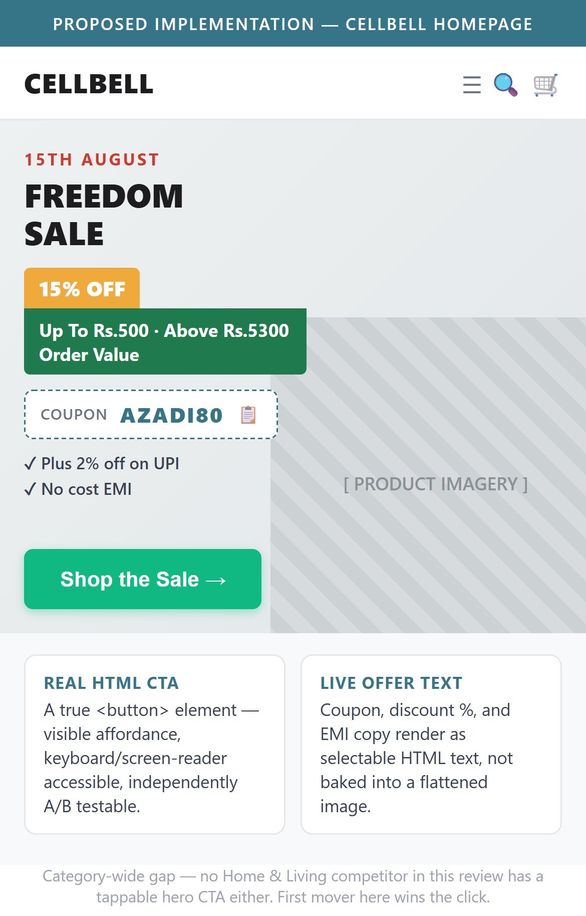
- Add a visible, labeled CTA button (e.g. 'Shop Freedom Sale') layered on top of each hero slide image, instead of relying on one full-bleed invisible link.
- Move variable offer text (coupon code, %, EMI line) out of the flattened image into live HTML/CSS layered on the slide, so it is selectable, accessible, and independently testable without a new image export each time.
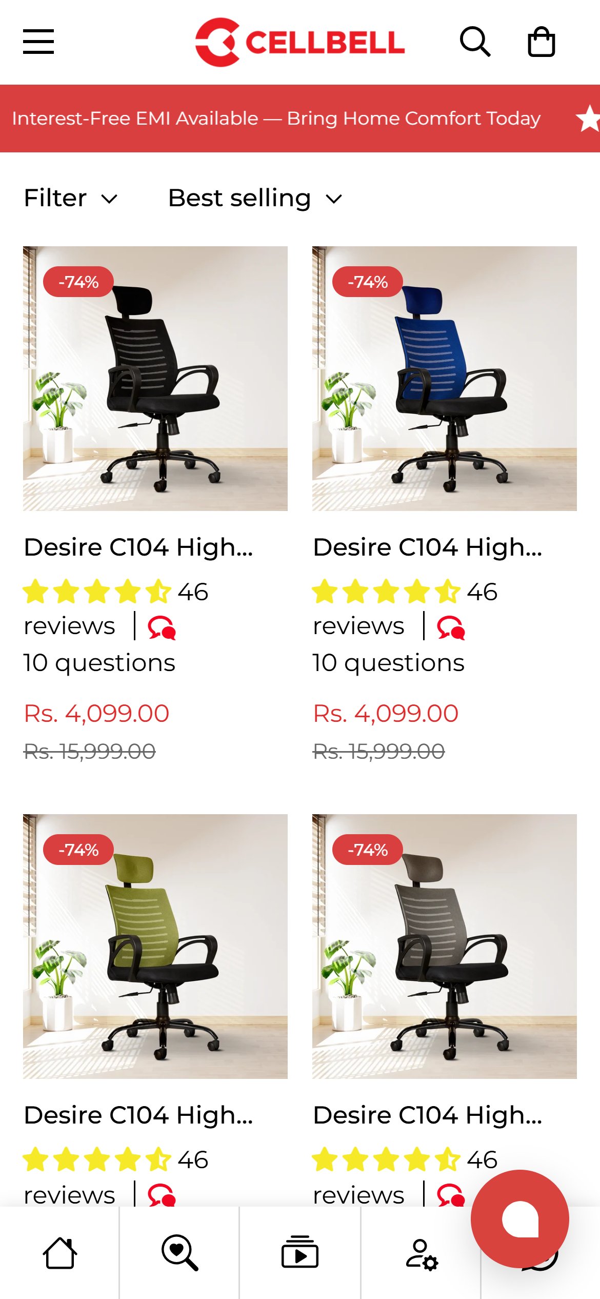
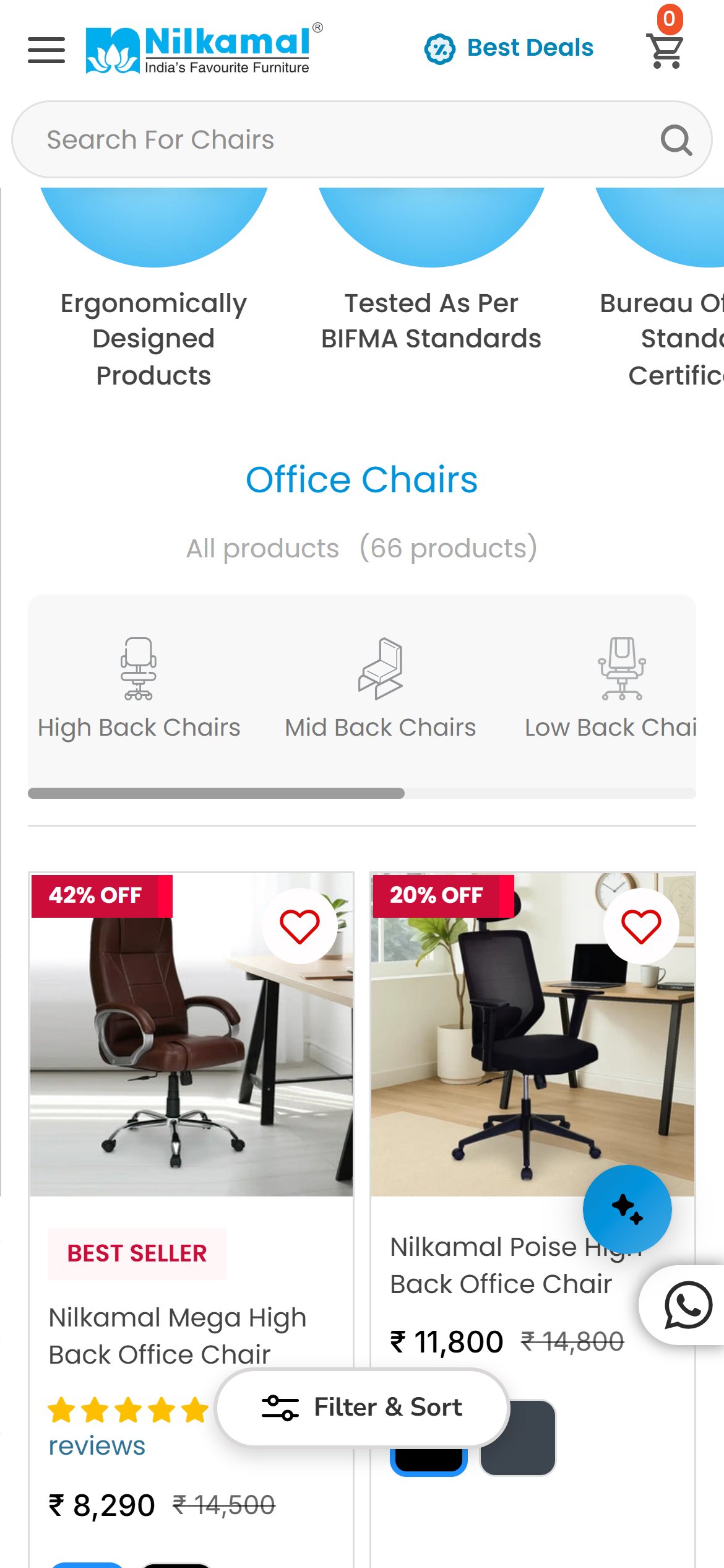
- The /collections/high-back-chairs grid lists 'Desire C104 High Back Chair (Black)', '(Blue)', '(Pistacho Green)', '(Grey)', '(Orange)' and '(Red)' as six separate cards — each with the identical Rs.4,099.00 / Rs.15,999.00 price and the identical 46 reviews / 10 questions count.
- A DOM check confirms all six cards link to the exact same product handle (/products/desire-c104-high-back-chair) with only the variant query parameter changing — this is one product listed six times, not six products.
- Product titles on the collection cards truncate to 'Desire C104 High…', cutting off the model/spec detail a shopper would need to tell cards apart even before noticing the price/review duplication.
- Splitting one SKU into six visually-identical tiles dilutes the product's own review count on the page (46 reviews reads as if it belongs to six different chairs) and pushes genuinely distinct products further down the grid.
- Render one card per product with a color-swatch selector (using the variant color data already present on the PDP) instead of one card per color variant.
- Show the full product title on the card, or a clean two-line clamp, so the model/spec name isn't cut off mid-word.
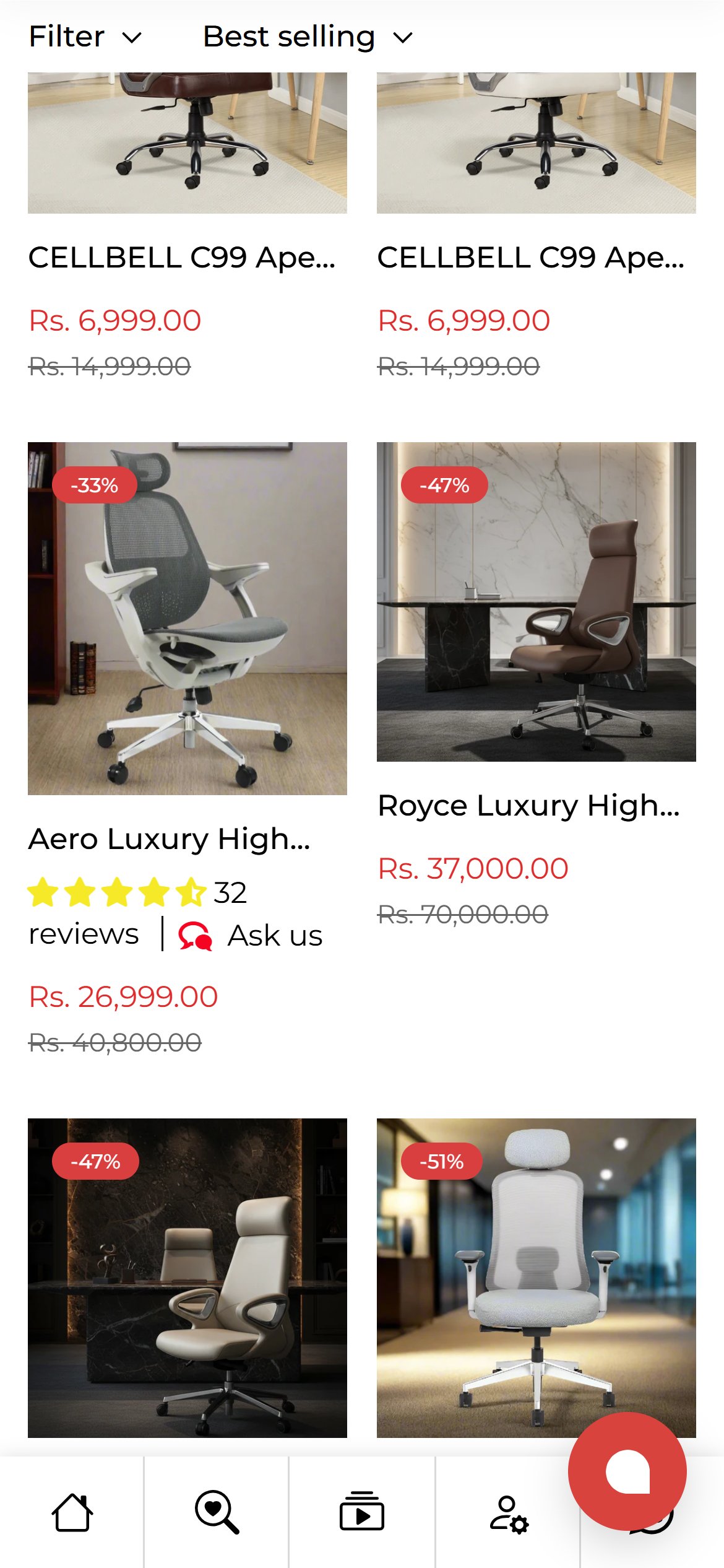
- Every collection card title renders with webkit-line-clamp:1 inside a fixed 172px-wide box (.m-product-card__name), so any title longer than roughly 20-22 characters is cut off mid-word with an ellipsis — confirmed on at least 12 distinct, non-duplicate products in the High Back Chairs grid, including 'Aero Luxury High…', 'Royce Luxury High…', 'Ace Max Luxury Hig…', 'ErgoGlide Executiv…', 'Cellbell Vega…' and 'CELLBELL C99 Apex…'.
- This is a separate, broader defect from the Desire C104 duplicate-card issue (see CP01) — it affects genuinely different products, not just repeated color variants of one SKU, so the fix needs to happen at the card-title template level, not only by consolidating variant cards.
- For multi-variant products the truncation is worse: 'CELLBELL C99 Apex High Back Leatherette Boss Chair (Black - Beige)' and its '(Blue)' / '(Brown)' / '(Grey - White)' siblings all clip to the identical 'CELLBELL C99 Apex…', so a shopper scanning the grid can't tell the cards apart by title alone.
- The full title text is present in the underlying markup (confirmed via element.innerText) — the constraint is purely the 172px card width plus single-line clamp, not missing product data.
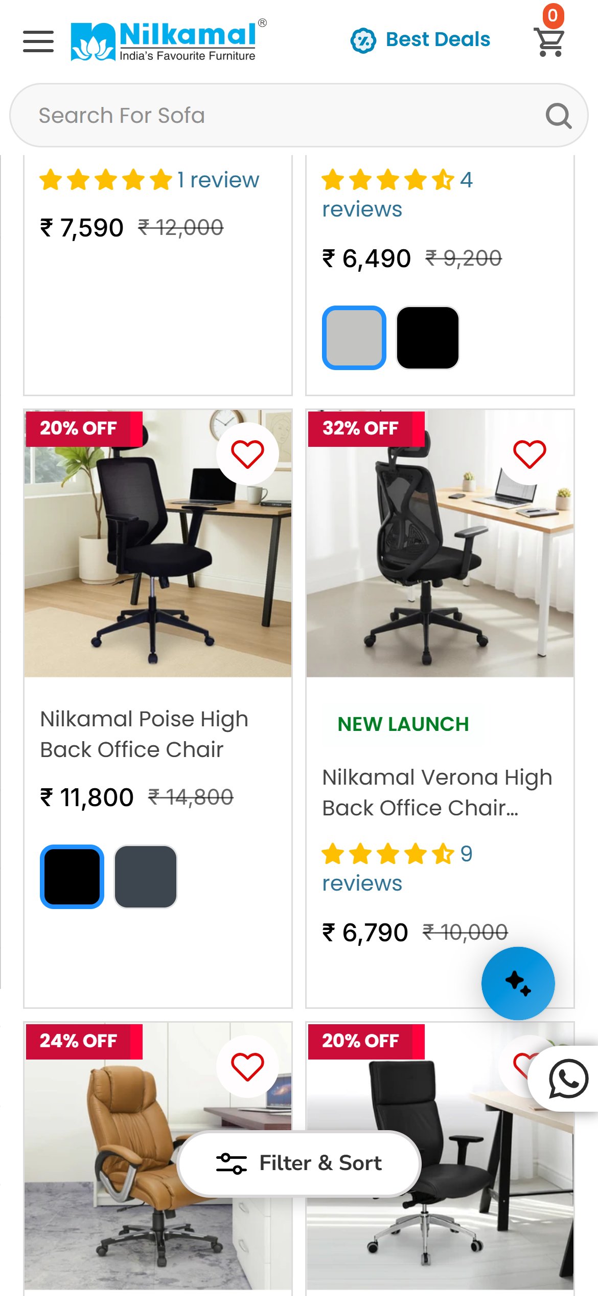
- Increase the title area to a 2-line clamp (-webkit-line-clamp: 2) so distinguishing words like the color or spec survive, matching the two-line-clamp pattern common elsewhere in the category.
- For color-variant products specifically, drop the color name from the truncatable title text and surface it as a separate swatch label instead — this pairs naturally with the CP01 swatch-consolidation fix.
- On the Shadow Gaming Chair PDP, the title ('Shadow Gaming Chair') sits at y=561px and the price/Add-to-Cart/pincode block follows immediately — but the visible star rating and review count don't appear until y=895px, 51px past the 844px first mobile screen.
- The theme actually ships a standard Judge.me rating badge (4.71 stars, 386 reviews) right under the title — but it is set to display:none in the page's own markup, so it never renders at all.
- Judge.me data is fully populated everywhere else on the site — every collection card shows a star rating and review count — so the fold-level suppression looks like an unintentional template gap rather than a deliberate design choice.
- Re-enable the existing Judge.me preview badge (currently display:none) directly under the product title, above the price.
- Confirm the fix across all PDP templates, since the hidden badge is a shared theme element, not specific to this one product.
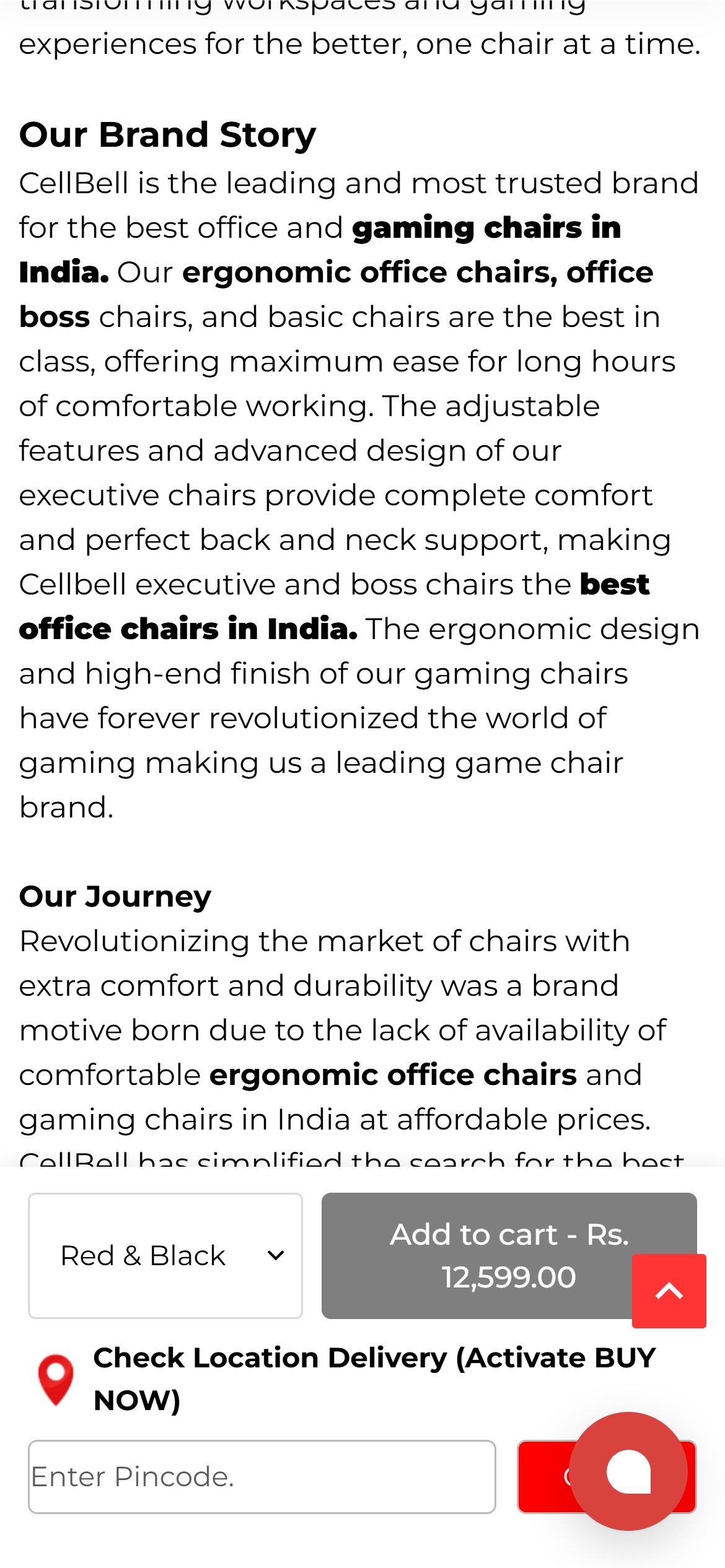
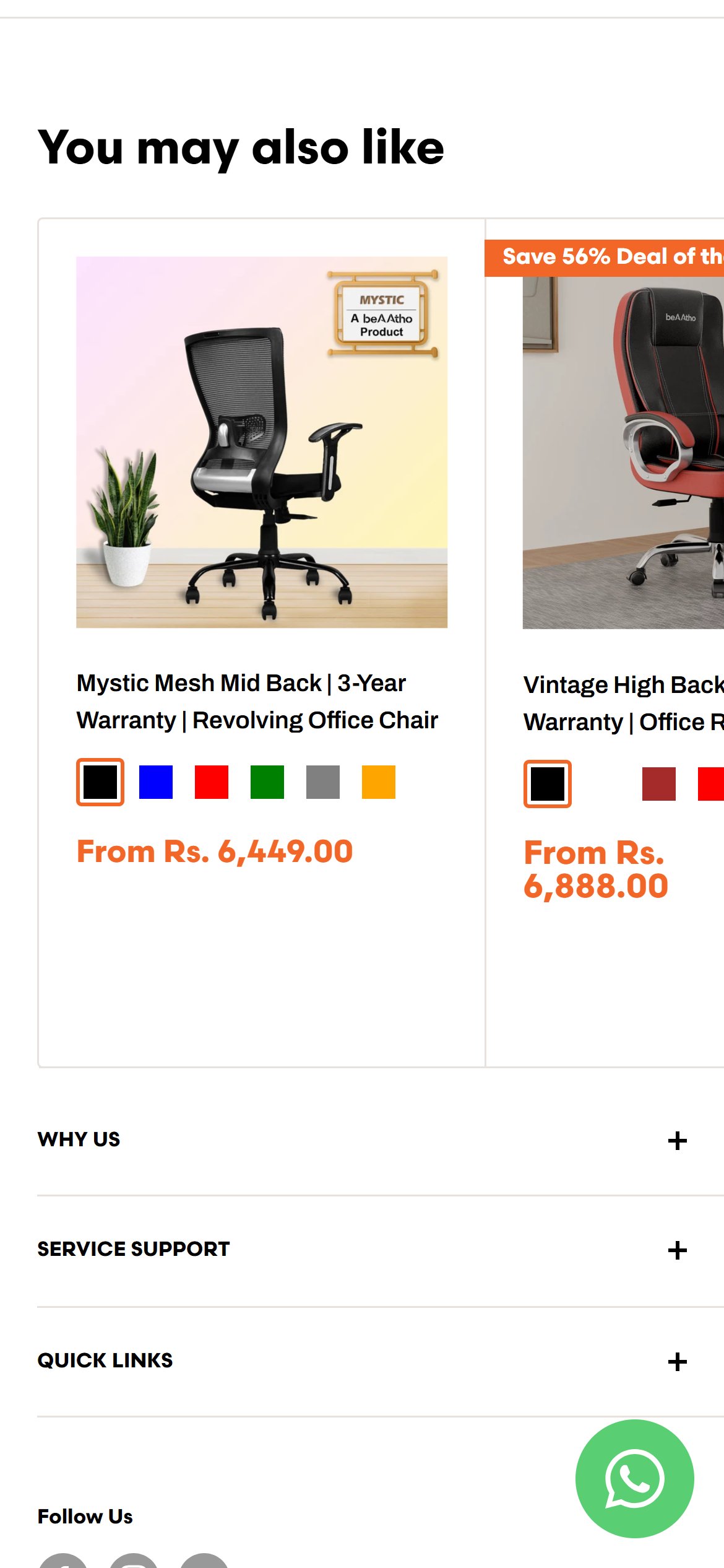
- Scrolling the Shadow Gaming Chair PDP fully to the bottom shows the page go straight from the customer-reviews section to the 'Our Brand Story' / footer content — there is no related-products, 'similar chairs', or 'customers also bought' module anywhere on the page.
- This is a specific missed opportunity because the CART page, just one step later in the funnel, DOES show a 'Recently Viewed Products' rail — the underlying recommendation component exists on the site, it simply isn't placed on the PDP.
- A shopper who decides this specific chair isn't right for them has no on-page path to a similar CellBell chair — they have to use the header navigation or the back button.
- Add a 'Similar Chairs' or 'You May Also Like' carousel below the reviews section, pulling from the same collection (e.g. High Back Chairs) or a curated cross-sell list.
- Reuse the same recommendation component/app that already powers the cart page's 'Recently Viewed Products' rail, rather than building a new one.
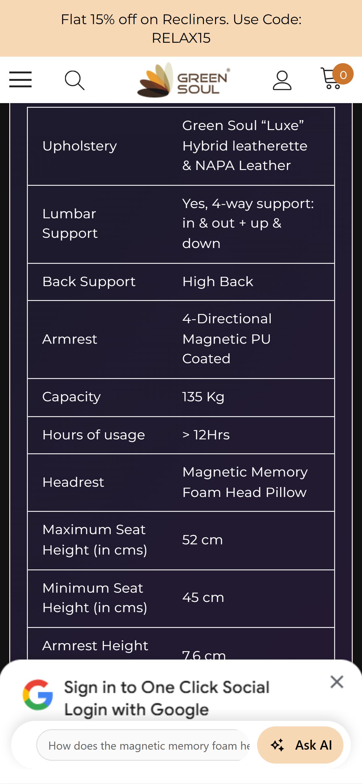
- The 'Product description' section covers foam density, PU leather finish, 4D armrests and hydraulics in marketing language, but never states a single measurement — no seat height, overall height, width, weight, or maximum weight capacity.
- A full-text regex scan of the entire rendered PDP (title, description, accordions) for dimension/inch/cm/kg/weight-capacity/seat-height terms returns zero matches anywhere on the page.
- The 'Installation Instructions' and 'What's in Box' accordion sections — which would normally carry size/assembly detail — both display literal placeholder text reading 'Loading Soon..' instead of real content.
- For a Rs.3,599–35,000 seating category bought sight-unseen online, the inability to check whether a chair fits a desk, a room, or a body type is a direct purchase-confidence blocker, not a cosmetic gap.
- Add a structured dimensions block (seat height range, overall height, width, depth, weight, weight capacity) directly on the PDP, ideally near the description or as its own accordion tab.
- Populate the 'Installation Instructions' and 'What's in Box' sections, which currently ship as unfinished 'Loading Soon..' placeholders on a live, purchasable product page.
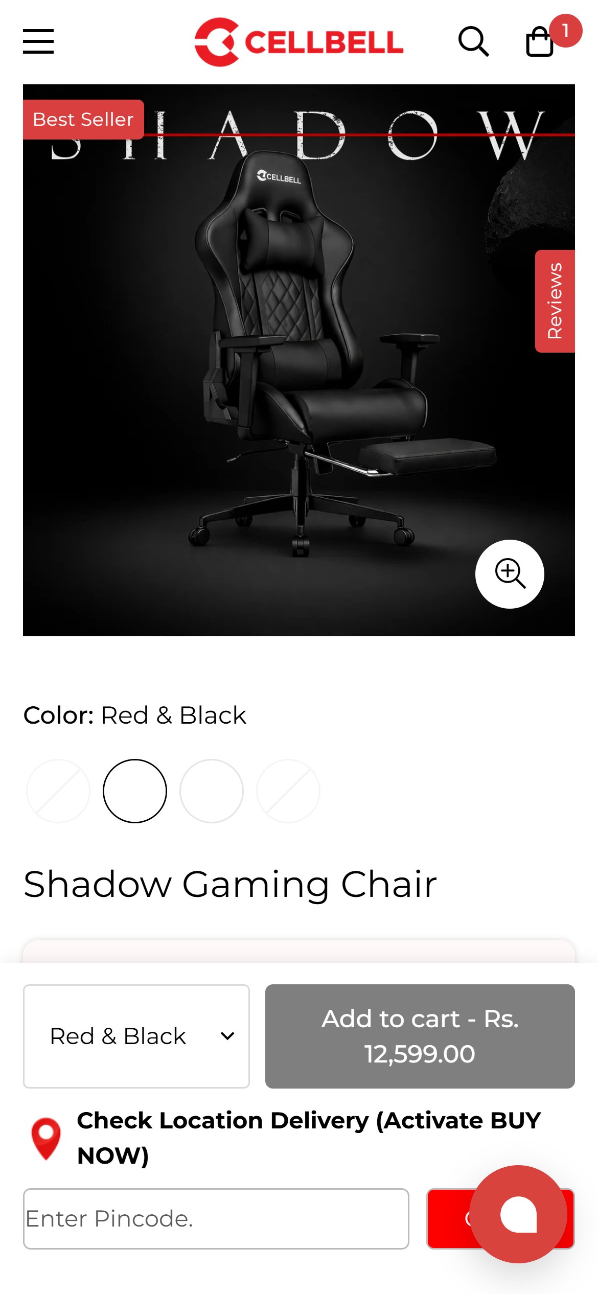
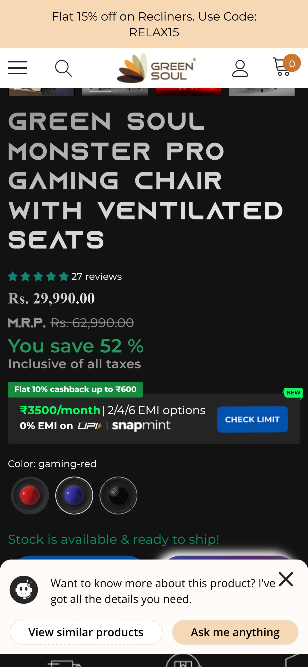
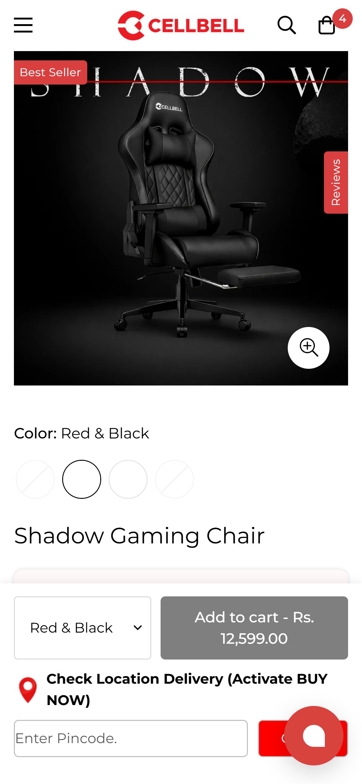
- The Shadow Gaming Chair offers four colorways — Full Black, Red & Black, White & Black, Grey & Black — but the swatch picker renders three of the four circles as completely blank with a diagonal 'no value' slash through them.
- The one circle that does render a fill shows solid black — for the currently-selected 'Red & Black' option — so even the one working swatch shows the wrong color.
- A DOM check confirms none of the four color option elements for this product carry a background-color style at all, unlike other PDPs on the site (e.g. the Desire C104 High Back Chair, where 5 of 6 color swatches DO render correctly) — this is an inconsistent data gap, not a site-wide missing feature.
- A shopper cannot tell 'Red & Black' apart from 'White & Black' or 'Grey & Black' without tapping each option individually and watching a small thumbnail change, adding friction to what should be a one-glance swatch pick.
- Populate the missing swatch color values for every variant on the Shadow Gaming Chair, and audit other PDPs for the same gap.
- Where a color name doesn't map to a single swatch color (e.g. 'Red & Black'), use a split/dual-tone swatch or a small product thumbnail instead of leaving it blank.
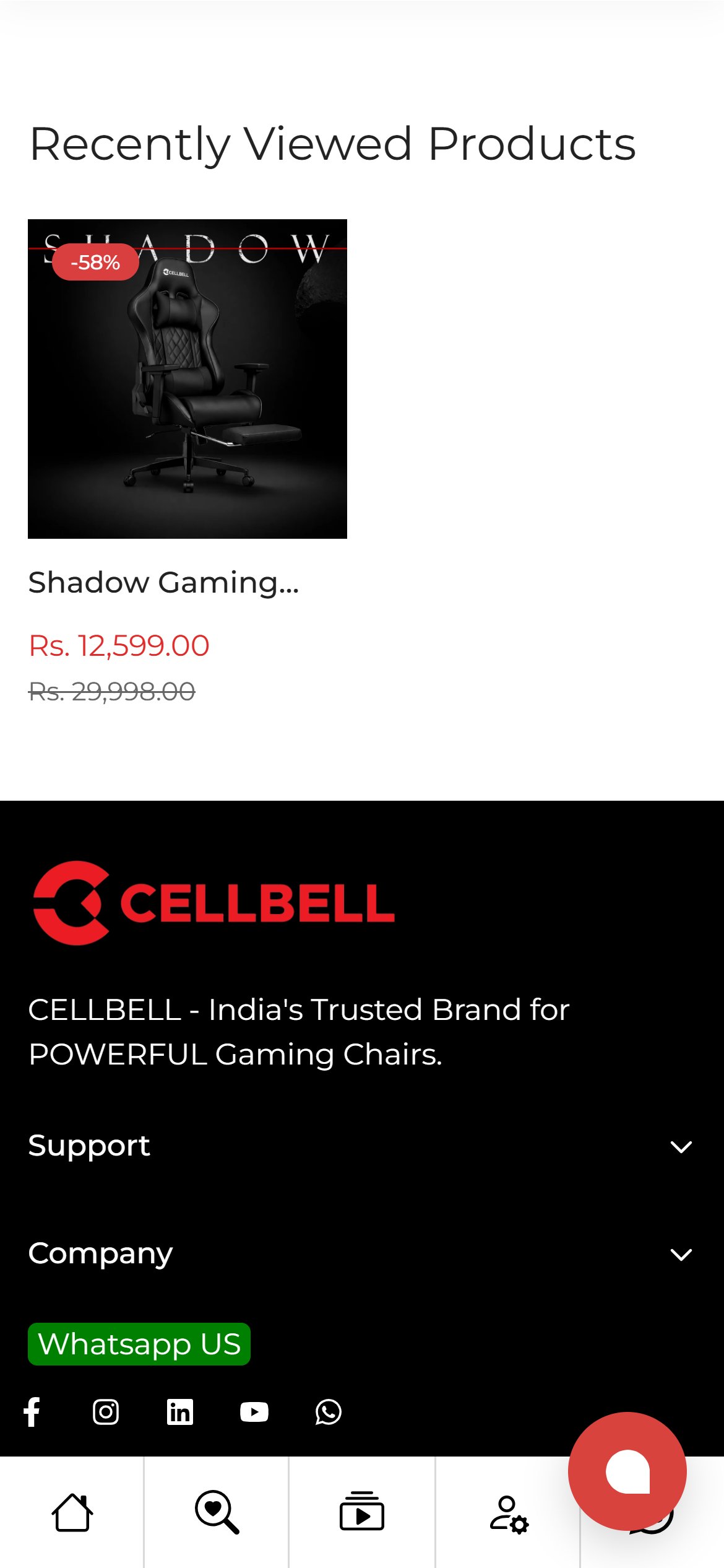
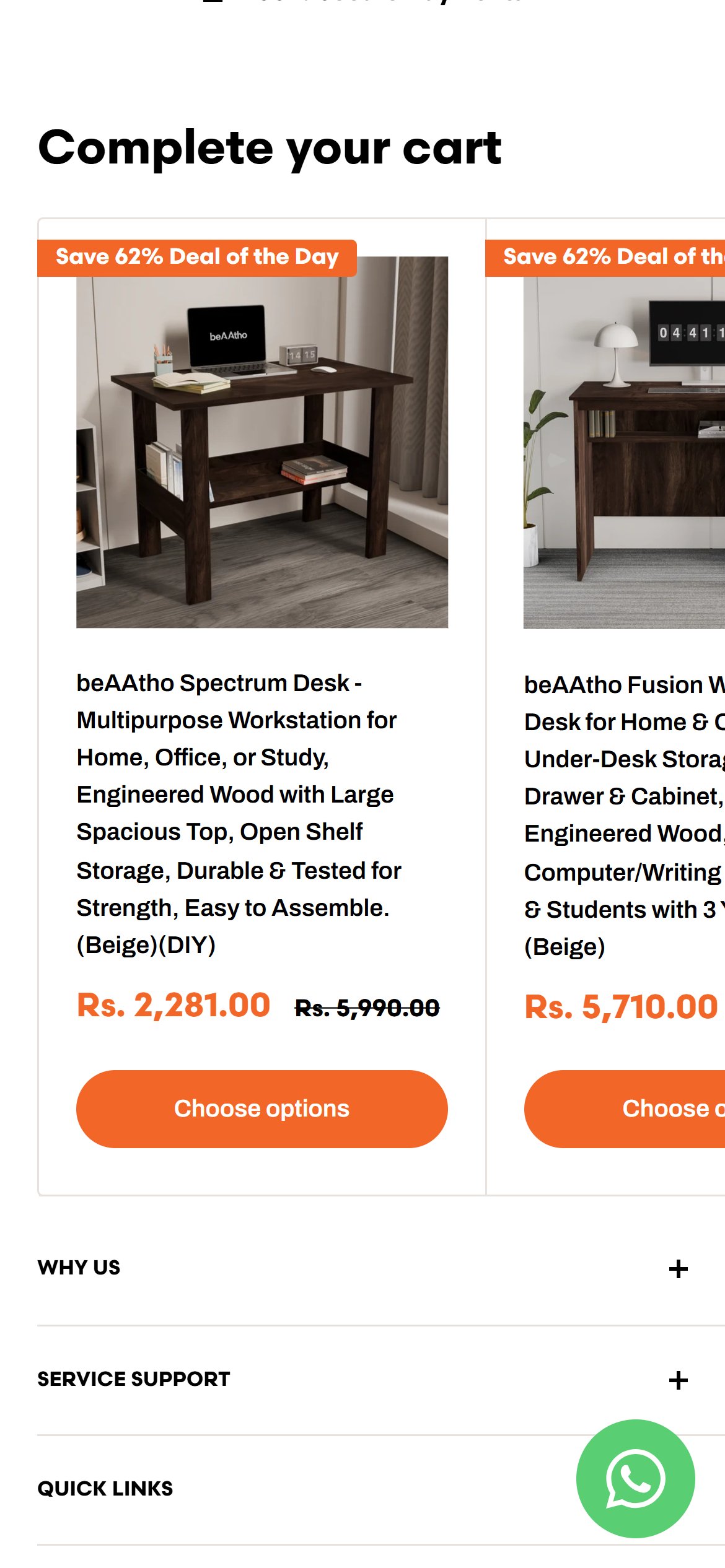
- The /cart page shows exactly one product module below the checkout button: 'Recently Viewed Products' — a single card reflecting browsing history, not a curated recommendation.
- The cart drawer (opened from the header cart icon) was checked separately and shows the same pattern — trust badges, reviews and a savings line, but no 'You May Also Like' or 'Frequently Bought Together' module.
- Recently-viewed is not merchandising — it only reflects what was already browsed, so it can't introduce a shopper to an accessory, a second chair for another room, or a higher-margin alternative.
- Add a 'Complete Your Setup' or 'Frequently Bought Together' rail in the cart (drawer and /cart page) — e.g. desk + chair, or chair + accessory — distinct from the existing 'Recently Viewed' rail.
- Prioritize the cart drawer first, since it is CellBell's default add-to-cart experience on mobile.
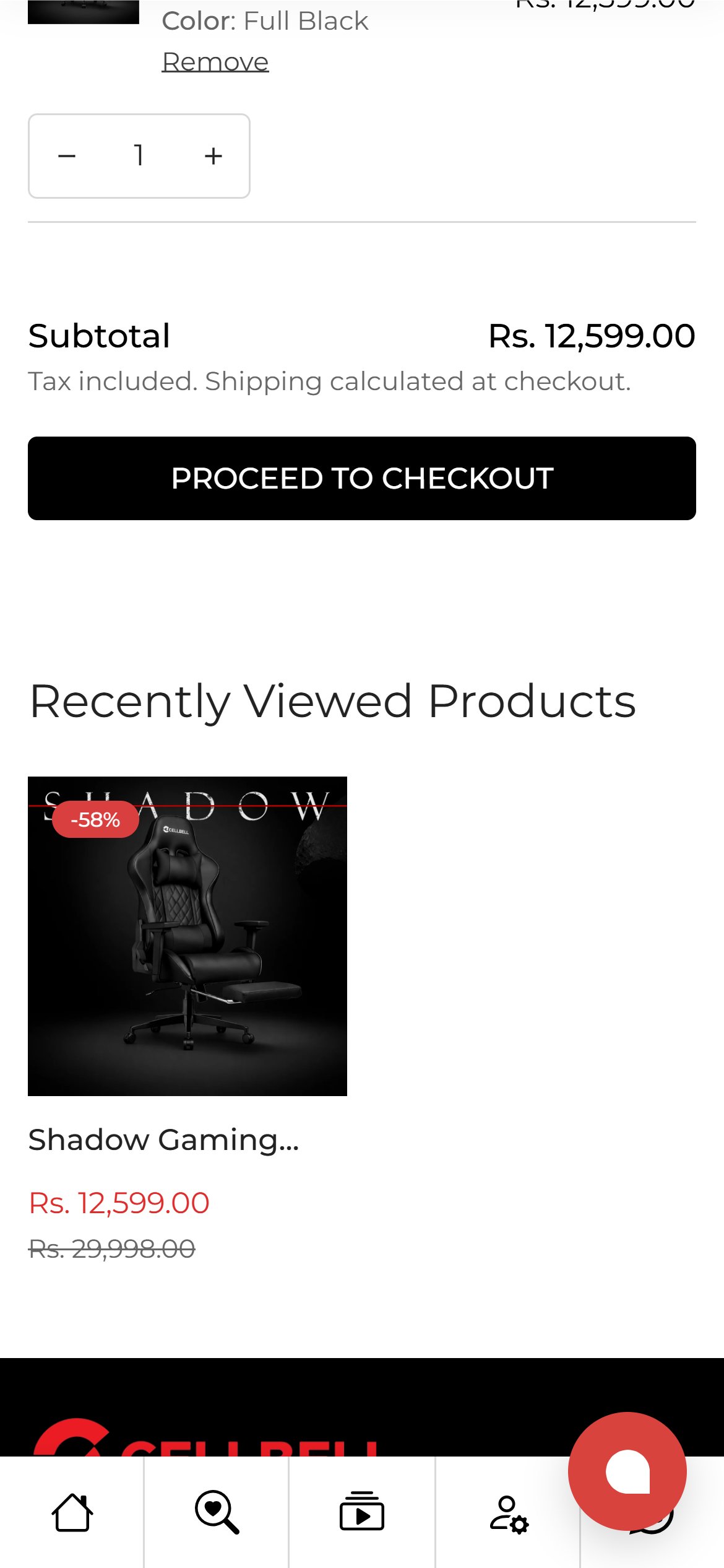
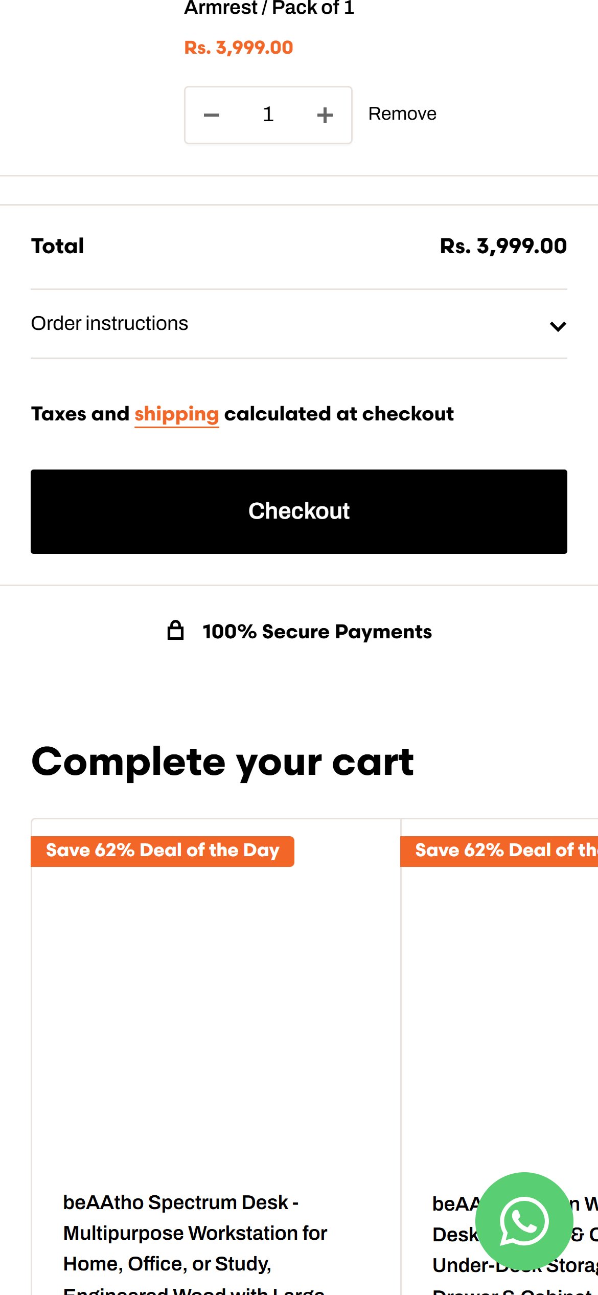
- On the /cart page, the area from the item row through 'Subtotal', the tax/shipping note and the black 'PROCEED TO CHECKOUT' button contains no payment-method icons, no security/lock badge, and no guarantee text of any kind.
- This is a real inconsistency, not a site-wide gap: the cart DRAWER (opened from the header cart icon) shows 'Free Delivery / 1 Year Warranty / 7 Day Return' badges plus review stars in the same flow — the /cart page carries none of it.
- A shopper who lands on /cart directly (bookmark, back button, shared link) gets a materially less reassuring checkout moment than one who adds via the drawer, on a Rs.12,000+ purchase.
- Port the drawer's 'Free Delivery / 1 Year Warranty / 7 Day Return' badge row (or an equivalent payment/security badge strip) onto the /cart page, directly above or below the checkout button.
- Standardize trust messaging so both cart experiences carry the same reassurance, since CellBell can't control which one a given shopper lands in.
App Ecosystem
What's installed vs what's missing from best-in-class Home & Living stores
Present (11)
Missing (2)
App Stack Assessment
CellBell has 11 identifiable apps/scripts covering payments, BNPL, reviews, urgency signals, video and chat — a reasonably full stack for a furniture DTC brand. The clear gap is cross-sell/bundle merchandising: no app surfaces 'customers also bought' or bundle recommendations on the PDP or in either cart experience, leaving basket-building entirely to the shopper.
Confidential — Prepared for CellBell by Growisto | August 2026